 DesignFlux Team
Your logo shows up everywhere: on your website, invoices, social profiles, packaging, email signatures and that tiny tab icon in someone’s browser. It has a lot of jobs to do, and most of them happen in a fraction of a second.
So what separates a logo that works from one that just looks nice in a presentation? After designing marks for brands like Coral, Lighthouse and Honey Badgers, here are the seven traits we look for every time.
1. It’s simple
The most recognizable logos in the world can be sketched from memory in a few seconds. Simplicity makes a mark easier to recognize, easier to remember and easier to reproduce.
Quick test: squint at your logo. If it turns into a blur of shapes, it’s probably carrying too much detail.
2. It works small
A logo that only looks good at full size isn’t finished. It needs to hold up as a 16-pixel favicon, a social media avatar and an app icon.
That’s why we design every logo with a compact icon mark alongside the full lockup, so you always have a version that reads clearly at small sizes.
3. It works in one color
Before color is added, a strong logo should work in solid black and solid white. If the idea depends on gradients or subtle shading, it’ll struggle on embroidery, stamps, single-color print and dark backgrounds.
4. It’s distinctive
Your logo needs to stand apart from competitors, not blend in. Look at the logos in your industry: if everyone uses a blue shield or a swoosh, that’s a reason to go another way.
Distinctive doesn’t mean complicated. Often it’s one unexpected detail, like a clever negative space or an unusual letterform, that makes a mark memorable.
5. It’s appropriate
A logo should feel right for the business and audience. A children’s brand, a law firm and a fitness studio all need very different personalities. Typeface, shape language and color all send signals before anyone reads a word.
When we designed the Momentum Fitness identity, the bold, energetic shapes and electric green were chosen to feel strong and active, not corporate.
6. It’s timeless (enough)
Trends come and go. Logos built around the style of the moment tend to look dated within a few years. Aim for something that will still feel right in five to ten years, then let your marketing materials carry the trendier elements.
7. It’s part of a system
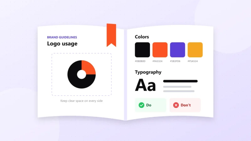
A logo is the anchor of your brand, not the whole thing. It works best alongside a defined color palette, typography and usage rules. Without those, even a great logo gets stretched, recolored and placed on busy backgrounds until it loses its impact.
That’s why we recommend pairing a new logo with at least a lightweight set of brand guidelines.
A quick logo checklist
Before you approve your next logo, run through these questions:
- Can I describe it in one sentence?
- Is it still clear at 32 × 32 pixels?
- Does it work in black and in white?
- Would it stand out next to my top three competitors?
- Does it feel right for my audience?
- Will it still feel right in five years?
- Do I have variations for different layouts?
If you can answer yes to all seven, you have a logo that’s ready to work hard.
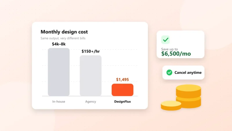
Need a new logo or a refresh? Logo design is included in every DesignFlux subscription, with unlimited concepts and revisions. Learn more about our logo design service.