 DesignFlux Team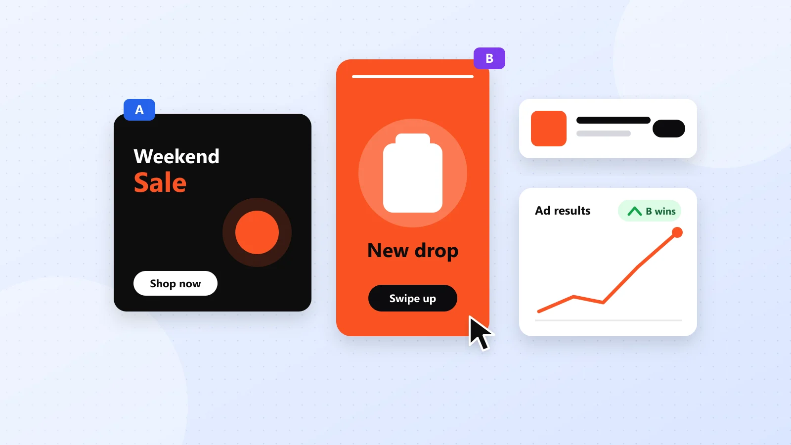
On today’s ad platforms, the creative is the targeting. Algorithms decide who sees your ad largely based on how people react to it. That means ad creatives that convert have more influence on campaign performance than ever.
Great targeting can bring your ad to the right audience, but weak design can still waste your budget. Whether you’re running Meta Ads, Google Display Ads or paid social campaigns, your visuals need to capture attention, communicate value and encourage action.
Here’s the checklist we use when designing ad creatives for clients.
1. Win the first second
People scroll fast. Your ad has roughly a second to earn attention. Lead with the most compelling visual element: A bold product shot; A face making eye contact; A striking color that contrasts with the platform’s interface; A big, punchy number (“Save 40%”).
If someone only glances at your ad, they should still get the main idea. For example, an ecommerce ad promoting a weekend sale should make the product and discount immediately recognizable. Don’t force viewers to read three lines of supporting text before understanding the offer.
The best ad creatives that convert establish a clear visual hierarchy. Your primary message should attract attention first, followed by supporting information and the call-to-action. Before launching, preview the design at its actual mobile display size. If the most important detail disappears, simplify the layout.
2. One message per ad
Trying to say everything usually means saying nothing. Each creative should communicate one clear idea: a single benefit, offer or pain point. If you have several messages, make several ads and test them.
For example, a skincare brand might want to promote affordability, natural ingredients and visible results. Instead of squeezing all three into one advertisement, create a separate design for each message. This approach helps you identify which benefit resonates with your audience.
Additionally, match the creative message to your campaign objective. An awareness campaign might introduce a problem, while a retargeting campaign might highlight a specific offer. Clarity improves the viewing experience and gives people a stronger reason to click.
3. Keep text short and readable
Your headline should be readable on a phone held at arm’s length. Practical rules: Aim for under 10 words of on-image text; Use high contrast between text and background; Avoid thin fonts and small sizes; Leave breathing room around text.
Remember that people often encounter ads while scrolling, commuting or multitasking. They rarely stop to study a complicated design. Therefore, prioritize a strong headline and use supporting copy only when it adds meaningful information.
For example, “50% Off Running Shoes” communicates an offer faster than a paragraph explaining why the shoes are worth buying. Typography matters just as much as the words themselves. Choose legible fonts, maintain consistent spacing and avoid placing important text over busy photography.
4. Make the call-to-action obvious
Tell people exactly what to do next: “Shop the sale,” “Book a free demo,” “Get the guide.” A visually distinct button shape or contrasting color makes the CTA stand out, even inside platforms that add their own button.
A strong call-to-action should match both your offer and the destination. For example, “Download the Free Guide” works when users receive a resource, while “Shop Now” makes more sense for a product promotion. Avoid vague instructions when a more specific action is available.
Also, give the CTA enough visual separation from other elements. It should be easy to identify without competing with the main headline. Effective ad creatives that convert guide the viewer naturally from the visual hook to the benefit and finally to the next action.
5. Stay on brand, but recognizably
Consistent fonts, colors and logo placement help people recognize you over time, which increases the effectiveness of every future ad. Make sure your logo is visible but not dominant. Let the message lead.
Brand consistency doesn’t mean every advertisement needs an identical layout. Instead, establish recognizable design elements such as your color palette, typography, photography style and logo positioning. You can experiment with different compositions while maintaining a consistent visual identity.
For example, a brand might test a product-focused advertisement against a lifestyle image. Both can look different while still feeling like they belong to the same company. This balance becomes particularly important when producing dozens of creatives across multiple campaigns.
6. Design for every placement
One concept usually needs many sizes: Square (1:1) for feeds; Portrait (4:5) for mobile feeds; Vertical (9:16) for stories and reels; Landscape (1.91:1) for some placements and display; Standard display sizes like 300 × 250, 728 × 90 and 160 × 600.
Don’t simply shrink one design. Recompose it so the key elements stay clear in each format. For example, a headline that fits comfortably inside a square Instagram ad might need a completely different arrangement in a vertical story. Likewise, a narrow display banner may require fewer words and a more compact product image.
When adapting creative assets, check the platform’s current placement specifications and safe areas. Keep important text, logos and calls-to-action away from areas that interface elements might cover. Designing for placement helps maintain readability and reduces the risk of awkward cropping.
7. Build variations for testing
The fastest way to improve ad performance is structured testing. For each concept, create variations that change one variable at a time: Headline A vs. headline B; Product photo vs. lifestyle photo; Discount framed as a percentage vs. a dollar amount; Light background vs. dark background.
Small changes can produce big differences in click-through rate. You won’t know which ones until you test. For example, a product advertisement with a clean white background might outperform a lifestyle version for one audience, while another audience responds better to seeing the product in use.
However, avoid changing every element simultaneously if you want to understand what caused the difference. Keep the audience, offer and other major variables consistent where practical. Then compare results using relevant metrics such as click-through rate, cost per click, conversion rate and cost per acquisition. For additional guidance, review Google’s best practices for responsive display ads.
Remember that clicks alone don’t guarantee sales. The strongest ad creatives that convert attract people who are genuinely interested in the offer. Structured testing turns design decisions into measurable learning.
8. Refresh before fatigue sets in
Even winning ads wear out as audiences see them repeatedly. Plan to refresh creatives regularly with new visuals, angles or formats, so performance doesn’t quietly decline.
Creative fatigue can appear when audiences repeatedly encounter the same advertisement. Signs may include declining click-through rates, rising acquisition costs or lower engagement. However, these changes can have other causes, so review campaign performance before assuming fatigue.
You don’t always need a completely new concept. Sometimes replacing the hero image, testing another headline or adjusting the visual layout gives an existing campaign a fresh direction. For brands running ongoing paid campaigns, maintaining a library of ready-to-launch creative variations makes the refresh process easier.
The quick checklist for ad creatives that convert
Before launching, ask:
Does it grab attention in one second?
Can viewers understand a single, clear message?
Is the text short and readable on mobile?
Does the CTA stand out clearly?
Will people recognize it as your brand?
Have you sized it for every placement?
Are variations ready to test?
Use this checklist during the final design review, not just when planning the initial concept. Check the advertisement on desktop and mobile, confirm the offer is accurate and make sure the landing page delivers what the creative promises. Also, review your testing plan. One attractive design isn’t enough to establish what works for your audience.
Testing needs volume, and volume is where unlimited design shines. With DesignFlux you can request as many ad variations and sizes as you need. See our ad creatives service.
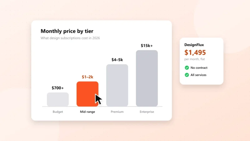
For businesses that regularly run paid campaigns, DesignFlux offers an unlimited graphic design subscription at $1,495 per month. This gives marketing teams a predictable design expense while supporting ongoing creative requests, placement adaptations and testing variations. Instead of treating each new ad size or creative refresh as a separate design purchase, you can maintain a consistent production workflow.
Ultimately, ad creatives that convert combine clear messaging, strong visual hierarchy, consistent branding and continuous testing. Build with these principles, measure the results and improve what works.