 DesignFlux Team
Your logo shows up everywhere: on your website, invoices, social profiles, packaging, email signatures and that tiny tab icon in someone’s browser. It has a lot of jobs to do, and most of them happen in a fraction of a second, which is where the traits of a great logo make the difference.
Understanding the traits of a great logo helps you create an identity that works across all those situations. A professional logo should look good, but it also needs to remain recognizable, flexible and appropriate for your audience.
So what separates a logo that works from one that just looks nice in a presentation? After designing marks for brands like Coral, Lighthouse and Honey Badgers, here are the seven traits we look for every time.
1. It’s simple
The most recognizable logos in the world can be sketched from memory in a few seconds. Simplicity makes a mark easier to recognize, easier to remember and easier to reproduce.
Quick test: squint at your logo. If it turns into a blur of shapes, it’s probably carrying too much detail.
A simple logo doesn’t necessarily mean a boring logo. It means removing unnecessary elements until the most recognizable parts of the design remain.
For example, a logo with multiple decorative shapes, several typefaces and detailed illustrations may look interesting at first. However, those details can compete with the main idea.
Instead, focus on one strong visual concept. This could be a distinctive symbol, a carefully designed wordmark or a combination of the two.
Simplicity is one of the most valuable traits of a great logo because it makes the design easier to apply across different materials without losing its identity.
2. It works small
A logo that only looks good at full size isn’t finished. It needs to hold up as a 16-pixel favicon, a social media avatar and an app icon.
That’s why we design every logo with a compact icon mark alongside the full lockup, so you always have a version that reads clearly at small sizes.
For example, a detailed horizontal logo might look excellent on a website header but become unreadable inside a small profile picture. A simplified symbol or monogram can solve that problem while maintaining brand recognition.
When reviewing a new identity, don’t judge it only on a large presentation mockup. Test the design at realistic sizes. Place it inside a browser tab, reduce it to a small social avatar and preview it on a mobile screen.
Pay particular attention to fine lines, small lettering and narrow spaces between shapes. If important details disappear when the logo becomes smaller, consider simplifying the mark or creating a dedicated compact variation.
A good logo system adapts to the available space rather than forcing one layout into every situation.
3. It works in one color
Before color is added, a strong logo should work in solid black and solid white. If the idea depends on gradients or subtle shading, it’ll struggle on embroidery, stamps, single-color print and dark backgrounds.
This is one of the easiest ways to test whether a logo’s underlying shape is strong enough. Remove every color, gradient and effect from the design. Then check whether the symbol remains recognizable.
If the concept only works because of shadows or multiple overlapping colors, it may be too dependent on visual effects.
That doesn’t mean colorful logos are bad. Color can communicate personality and improve brand recognition. However, the essential shape should ideally remain identifiable without it.
Also, check how your logo appears on different backgrounds. The W3C’s guidance on non-text contrast explains why meaningful graphical elements need sufficient visual contrast. Although logos have specific accessibility exemptions, using appropriate light and dark variations can improve their visibility.
Prepare solid black, white and full-color versions so your team can choose the correct option for each application.
4. It’s distinctive
Your logo needs to stand apart from competitors, not blend in. Look at the logos in your industry: if everyone uses a blue shield or a swoosh, that’s a reason to go another way.
Distinctive doesn’t mean complicated. Often it’s one unexpected detail, like a clever negative space or an unusual letterform, that makes a mark memorable.
Before approving a design, research the visual identities of your closest competitors. Place their logos together and compare the symbols, typography, colors and overall compositions.
If your proposed logo looks interchangeable with several existing brands, reconsider the direction.
For example, a technology company doesn’t automatically need a circuit pattern, and a real estate business doesn’t always need a roof symbol. A more distinctive approach might come from the company’s name, personality, history or specific positioning.
However, visual differentiation isn’t the same as legal availability. The United States Patent and Trademark Office recommends conducting a comprehensive trademark clearance search to identify potentially conflicting marks before registration.
A competitor review helps with creative direction, while a proper trademark search helps identify legal risks.
Among the essential traits of a great logo, distinctiveness plays an important role in helping customers recognize your business instead of confusing it with another.
5. It’s appropriate
A logo should feel right for the business and audience. A children’s brand, a law firm and a fitness studio all need very different personalities. Typeface, shape language and color all send signals before anyone reads a word.
When we designed the Momentum Fitness identity, the bold, energetic shapes and electric green were chosen to feel strong and active, not corporate.
This demonstrates why logo design should begin with the brand’s positioning rather than personal preference alone.
For example, a professional financial services company might benefit from structured typography and a restrained color palette. Meanwhile, a children’s clothing brand might use softer shapes, warmer colors and more expressive lettering.
Neither style is automatically better. The right choice depends on the audience and the message the business wants to communicate.
Consider the brand’s personality, industry and customer expectations before selecting a direction.
Also, remember that appropriate doesn’t mean predictable. A logo can challenge industry conventions while still communicating the right level of professionalism, energy or trust.
The goal is to make the identity feel intentional and recognizable.
6. It’s timeless (enough)
Trends come and go. Logos built around the style of the moment tend to look dated within a few years. Aim for something that will still feel right in five to ten years, then let your marketing materials carry the trendier elements.
This doesn’t mean your logo must remain unchanged forever. Businesses evolve, and even established brands occasionally refine their identities. However, there’s a difference between thoughtful evolution and redesigning a logo simply because a new visual trend becomes popular.
For example, an overly decorative type treatment might attract attention today but become difficult to use consistently as design preferences change. A simpler, more balanced identity can provide a stronger long-term foundation.
When evaluating a logo, imagine how it might appear across future packaging, websites, advertising campaigns and physical signage.
Ask whether the concept represents your business or merely reflects the design style currently dominating social media.
One of the overlooked traits of a great logo is its ability to remain useful even when marketing trends change around it.
7. It’s part of a system
A logo is the anchor of your brand, not the whole thing. It works best alongside a defined color palette, typography and usage rules. Without those, even a great logo gets stretched, recolored and placed on busy backgrounds until it loses its impact.
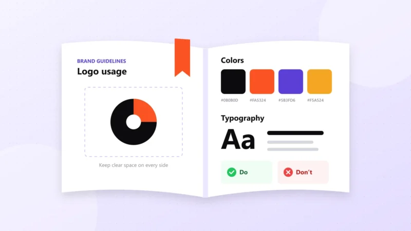
That’s why we recommend pairing a new logo with at least a lightweight set of brand guidelines.
For example, your brand guidelines should explain which logo variation to use, how much clear space to maintain and which backgrounds are acceptable. They should also define your color palette, typography and supporting visual elements.
Without these rules, different designers and marketing teams may interpret your identity differently. One person might stretch the logo to fit a banner, while another changes its colors to match a promotion.
Over time, those small changes weaken consistency.
A complete logo system should include primary and secondary variations, a compact icon, appropriate color versions and clear usage instructions.
You should also receive practical file formats for digital and print applications. For example, SVG files work well for scalable digital graphics, while suitable vector formats support professional printing.
The strongest identities make it easy for everyone involved to use the logo correctly.
A quick checklist for the 7 traits of a great logo
Before you approve your next logo, run through these questions:
Can I describe it in one sentence?
Is it still clear at 32 × 32 pixels?
Does it work in black and in white?
Would it stand out next to my top three competitors?
Does it feel right for my audience?
Will it still feel right in five years?
Do I have variations for different layouts?
If you can answer yes to all seven, you have a logo that’s ready to work hard.
However, don’t rely on a polished presentation alone. Test the logo in realistic applications, including a website header, social profile, business card and promotional graphic.
Try it against light and dark backgrounds. Check its readability at small sizes and compare it with other brands in your industry.
If possible, ask a few people from your target audience what the logo communicates to them. Their responses can reveal whether the design creates the impression you intended.
What to check before final approval
Beyond visual quality, confirm that your final logo package contains the files your business needs.
At a minimum, request appropriate vector files, transparent-background versions, black and white variations, and a simplified mark if the design requires one.
Also, make sure you understand which logo version belongs in each situation.
These practical checks help turn a promising design into an identity your business can use confidently.
Why the traits of a great logo matter for your business
A logo isn’t just a decorative graphic. It’s a recognizable part of how customers identify your business across different experiences.
A strong identity makes it easier to maintain consistency when creating packaging, advertisements, social media graphics and website content.
However, a good logo alone won’t guarantee business success. Your products, customer experience, messaging and marketing also influence how people perceive your brand.
The logo’s job is to support that larger identity.
That’s why the traits of a great logo focus on practical performance rather than appearance alone.
Need a new logo or a refresh? Logo design is included in every DesignFlux subscription, with unlimited concepts and revisions. Learn more about our logo design service.
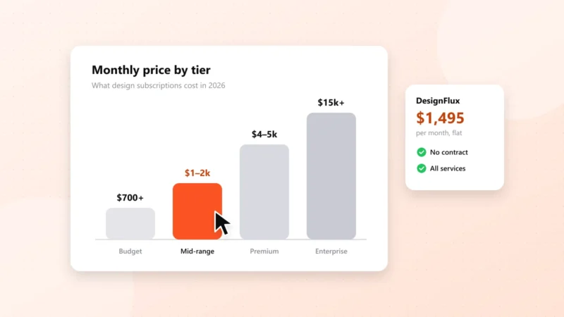
At $1,495 per month, DesignFlux provides an unlimited graphic design subscription for businesses that need logo design, brand identity and ongoing creative support.
Whether you’re launching a new business or improving an existing identity, start with these seven principles. A logo that’s simple, scalable, distinctive, appropriate and supported by clear brand guidelines will be easier to recognize and use across your business.