 DesignFlux Team
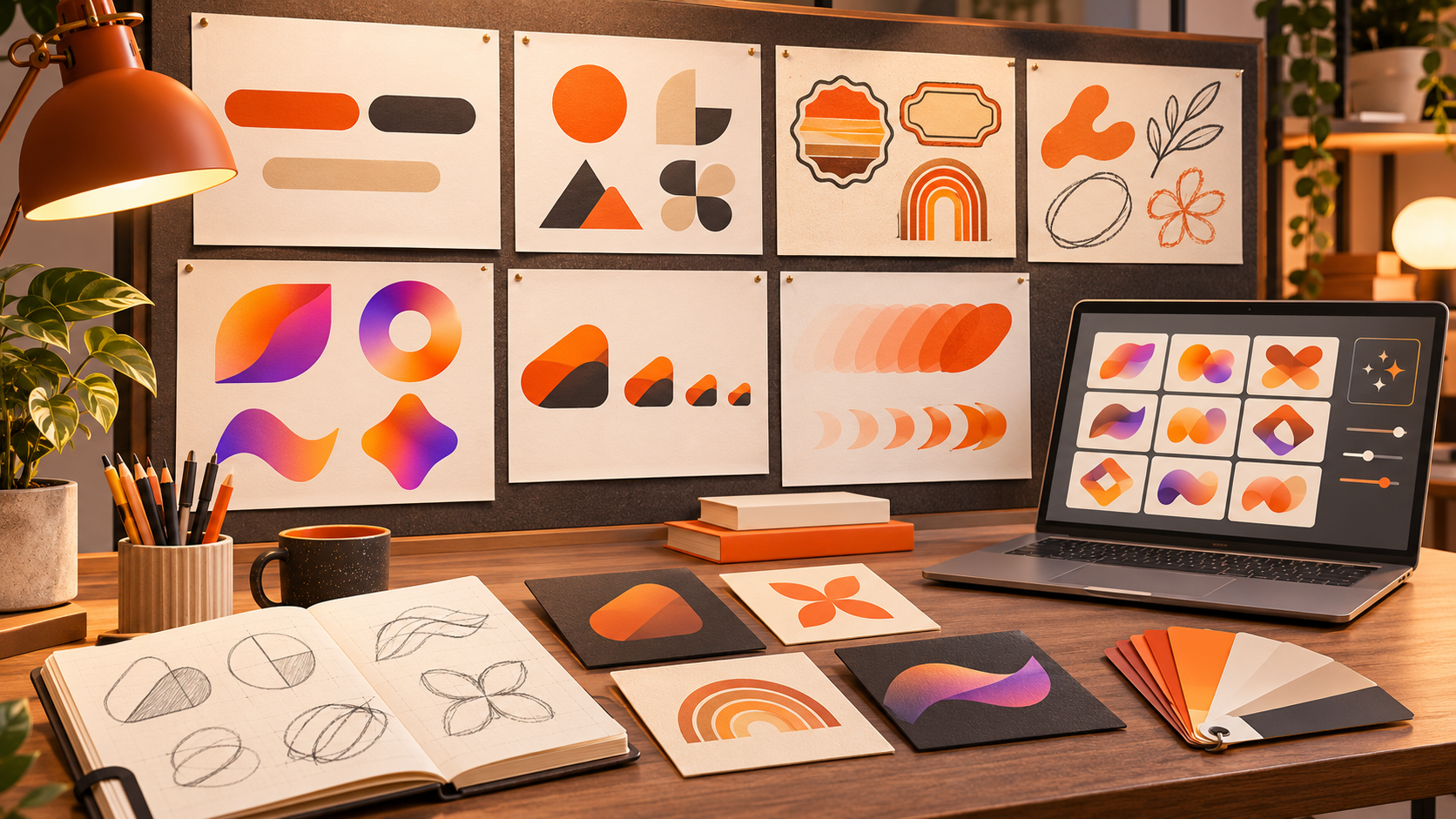
Logo design trends 2026 point to a clear shift. Simple, flexible and honest logos are winning. Small business owners do not need the loudest mark. They need a logo that works on a website, a shop sign, a social profile and a printed invoice.
That is why this guide focuses on practical choices. It explains what is working now, who each trend suits, and what to avoid before you spend money on a rebrand. If you are still weighing the budget side, our guide to how much logo design costs breaks down the real price ranges first.
Logo Design Trends 2026: Simple Wordmarks Are Leading the Way
A simple wordmark puts the business name at the centre. The letters carry the identity, often with a small change in weight, spacing or a single letterform.
This trend suits service businesses, consultants, agencies and new brands that need people to remember a name. It also suits businesses that use their logo in small spaces, because a clean wordmark stays readable.
However, skip a plain wordmark if your name is long, hard to spell or very similar to a competitor. In that case, you may need a stronger visual mark to stand out.
Flat Minimal Marks Still Work in 2026
Flat minimal marks use simple shapes, clear lines and limited detail. They load well, print well and stay clear at small sizes.
This style suits tech brands, online stores, health businesses and modern service companies. It also helps when a logo must work as a website favicon, an app icon or a social media avatar.
Skip this trend if your brand depends on warmth, craft or heritage. A very minimal mark can feel cold or generic for a bakery, a handmade goods shop or a family business with a strong story.
Retro and Vintage Revivals Feel Familiar and Trusted
Retro and vintage styles borrow from older lettering, badges, serif type and classic colour palettes. They feel established, even when the business is new.
This trend suits coffee shops, barbershops, breweries, local shops, food brands and heritage businesses. It can build trust fast because it feels familiar.
However, avoid a full vintage look if you serve a modern tech audience or want to appear forward-looking. In that case, use one retro detail, such as a serif font or a warm colour, rather than a full period style.
Hand-Drawn and Organic Shapes Add Personality
Hand-drawn marks use uneven lines, soft curves and natural shapes. They feel human, friendly and less corporate.
This trend suits creative studios, wellness brands, food businesses, childcare services and independent shops. It works well when the owner is the face of the brand and wants a personal feel.
Skip it if your business needs a formal or technical image. A hand-drawn logo can look unpolished for a law firm, a finance company or a business that sells precision and trust through structure.
Bold Gradient Use in 2026 Logo Design
Bold gradients add depth and energy to a logo. They work well in digital spaces, where colour can shift across screens, video and social media.
This trend suits beauty brands, fitness businesses, entertainment brands, apps and brands aimed at younger customers. A well-chosen gradient can make a simple shape feel modern and lively.
However, use gradients with care. A logo should still work in one colour. If the gradient hides the shape or makes small text hard to read, it has gone too far. Always test the logo in black and white first.
Variable and Responsive Logos Fit Every Screen
A variable logo is not one fixed image. It is a small set of related versions: a full logo, a short version, an icon and a stacked layout.
This trend suits almost every small business in 2026. It helps because the same logo must fit a wide website header, a small phone screen, a square profile picture and a printed receipt.
If you choose only one logo file, you will often crop it, shrink it or stretch it. A responsive set avoids that problem and keeps the brand clear in every place.
Motion-Ready Logos Are Becoming Practical
Motion-ready logos are built to move. A letter can slide in, a shape can unfold, or an icon can change gently in a short video or animation.
This trend suits brands that use video, social media, online ads or a website with movement. It can make a simple logo feel more alive without changing the core design.
However, skip heavy animation if your main customers find you through print, signage or a simple website. Motion should support the logo, not replace a clear static version.
AI-Assisted Logo Tools: Useful, But Not a Final Designer
AI-assisted logo tools can help at the start. They can create quick ideas, suggest layouts and help a business owner see different directions before hiring a designer.
This trend suits owners who need a fast starting point or want to explore ideas on a tight budget. It can also help teams agree on a style before they invest in a final design.
However, do not treat an AI tool as the final designer. Many tools reuse similar shapes, fonts and layouts. As a result, the output can look like many other businesses. Use AI for ideas, then let a designer refine the logo into something original and ownable. The US Copyright Office’s January 2025 report on AI and copyright also notes that a prompt alone does not make an output copyrightable, which is one more reason to have a designer create the final mark. We looked at this in detail in our guide to whether ChatGPT can create a logo.
For many small businesses, that middle step is where an unlimited graphic design subscription helps. DesignFlux is an unlimited graphic design subscription at $1,495/month, with a dedicated designer and project manager, unlimited requests and revisions, 24-48 hour turnaround, and no contracts. It can turn a rough idea into a polished logo system without hiring a full-time designer.
What to Avoid in Logo Design Trends 2026
First, avoid overused generic AI-generated marks. If a logo looks like a simple globe, a leaf, a swoosh or a geometric animal, it may already look familiar. A logo should help customers remember your business, not blend into a long list of similar marks.
Next, avoid clip-art style icons. Simple icons are useful, but copied or dated clip-art makes a brand look cheap. A custom mark, even a simple one, will look more professional.
Also, avoid gradients that kill legibility. A gradient should support the design, not hide it. If the text becomes hard to read, choose a stronger contrast or a solid colour version.
Finally, avoid trends that date fast. A style that looks clever today can look old in two years. So choose a logo that still works if you remove the trend. If the core shape and name remain strong, the logo has a better chance of lasting.
How to Choose the Right Logo Trend for Your Business
Start with your audience, not the trend. Ask who needs to trust you and where they will see your logo first.
Then, test the logo in real sizes. Check it on a phone, a business card and a large sign. If it stays clear in all three, it is a good practical choice. Our list of the traits of a logo that actually works is a useful checklist for this step.
Also, think about the next five years. A logo should support growth, not limit it. A simple and flexible design is easier to update than a complex one.
Finally, keep the design honest. A logo should reflect what your business does and how it works. That is more valuable than following every new style.
FAQs
How do I choose the best logo trend for 2026?
Start with your audience and where they will see your logo. Then, choose a trend that fits your brand personality and works at small sizes. Finally, test the logo on a website, a social profile and in print before you commit to it.
Should small businesses follow logo design trends 2026 or stay classic?
Follow a trend only if it fits your brand and audience. A classic logo is often the safer choice for a long-term business. However, a modern detail can refresh a classic mark without making it look dated in a few years.
Are AI logo makers good enough for a small business?
AI logo makers can help you explore ideas fast. However, they often produce generic results that look similar to other brands. Therefore, use them for inspiration, then work with a designer to create a final logo that is original and suited to your business.
What makes a logo work across website, print and social media?
A good logo uses a simple shape, clear type and strong contrast. It also needs different versions for wide, square and small spaces. In addition, it should stay readable in one colour and at a small size.
How often should a small business update its logo?
A logo does not need a fixed update schedule. Instead, review it every few years or when your audience, services, or market position changes in a clear way. If the mark still feels clear and relevant, keep it. If it feels dated or confusing, plan a careful update.